Monday, June 23, 2008

Google Earth


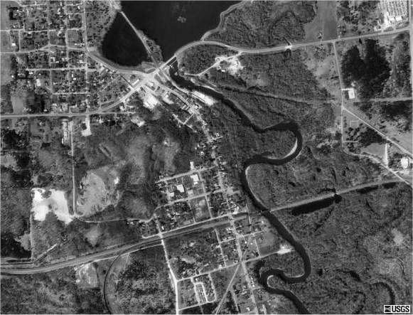
I'm always interested in maps of Malta. I was excited to play around with Google Earth and spent a couple of hours trying to find my grandfather's house in Ghaxaq. It got blurry after a certain point, so I'm assuming there isn't as much data for somewhere "remote" like this. My favorite feature of Google Earth is the ability to add photos to locations.
This map of Malta shows vegetation levels on the island. As you can see there is not much and it is concentrated inland. The Vegetation Programme uses SPOT 4 and SPOT 5 for remote sensing. More information is available here.

Monday, June 16, 2008

Digital Orthographic Quater-Quads or DOQQ


This DOQQ map can be found at Forestpal.com. DOQQ maps are areial photos that have been orthorectified. This process removes distortion, putting features in their correct position. After a photos has been orthorectified it is useable as a map.

Digtial Elevation Models or DEM


This map of New South Wales is a digital elevation model. Color is used on this map to bring out relief. Without a legend it is still possible to conclude that the red areas are highest and the blue areas are lowest. More information on this map can be found at the New South Wales Government wesbsite.

Digital Line Graph or DLG


This map found on the USGS website is a digital line graph. Unlike the DRG, these maps use vector rather than raster data. Instead of the data being pixilated the data is stored as lines, points, and areas.

Digital Raster Graphic or DRG


A digital raster graphic is a digital version of a USGS or United States Geological Survey. They are topographic maps that are 7.5 min of latitude and 7.5 min of longitude with a scale of 1:24,000. DRG's are georectified which means it has been linked to real world positions using coordinates, datum, and projection. This map came from the Illinois Natural Resources Geospatial Data Clearinghouse.

Bivariate Choropleth Map

The bivariate choropleth map shown here is using both color and proportional circle to show a relationship between the ratio of male to femal workers and the average income of male and female workers. This was found on an Intro to GIS site. Bivariate choropleth maps are thematic maps showing relationships between two variables.

Wednesday, June 11, 2008

Unclassed Choropleth Map

This map shows the divorce rates in the united states by area. That's what makes it a choropleth map. It is an unclassed choropleth map because it uses a continuous scale. There are as many intervals as there are areal units. I found this map on the ESRI website in a paper written by Naresh Kumar

Classed Choropleth Map

Illinois State University  offers up an additional source for anyone who is still somewhat confused on classed choropleth maps and the classification techniques used for them. First of all take a look at the legend. This map has four intervals. A choropleth map can have different intervals and the number used can change the way the map looks. Also, look at the way the interval is broken up. There are four classification techniques: Equal steps, Quantiles, Natural Breaks, and Minimum Variance. 

Choropleth Maps

The purpose of a choropleth map is to show areal data. The information is usually relating to area and is usually in measurements of square mile. Choropleth maps average area either using density or percentages. There are many types of choropleth maps. This map shows average areal distribution of orchards in the united states. It came from the USDA website. 

Range Graded Proportional Circle Map

Turning again to Rutgers, this is a classic example of a range graded proportional circle map. It is the other type of proportional circle map. In range graded proportional circle maps, only a set number of circles are used. 

Continuous Variable Proportional Circle Map

The map of Canada found at the Canada National Statistical Agency  shows a continuous variable proportional circle map. There are two types of proportional circle maps. The best way to tell this one apart from the other one is from the legend. The circles come in all sizes representing the distribution of the variable. 

Proportional Circle Map

This map provided by The University of California, Santa Barbara's geography department, is an example of a proportional circle map. This is another type of point pattern map. Notice how, unlike the dot density map from before, the circles get larger as the variable increases. This particular map shows internet usage throughout Europe. 

Dot Density Map


The University of Washington  website is where I found this map of China. Dot density maps are a type of point pattern map. Each dot represents 50,000 people. Despite the large area of China (about the same as the United States) its population is concentrated in specific regions. The coastal area is most populous because of the booming pacific rim economy. Other population densities focus around rivers. 

Flow Map

The University of Texas has a nice catalog of maps on their library website. This one is of a flow map. Flow maps show the intensity of travel along a path. As the lines grow thicker, the intensity also grows. This map shows commercial truck flows for the United States. 

Isopach Map

Isopach maps are contour maps that represent rock thickness in the third dimension. The South Florida Information Access website has this map that shows the rock density of the Florida Aquifer. 

Isohyet Map

The Hong Kong Observatory has this Hypsometric map that also shows contour lines. The contour lines on this map of Hong Kong are called ishoyets. Isohyets provide infomration on rainfall levels. 

Isotach Map

Isotach maps use contour lines to represent information on wind speed. This map shows windspeeds around Florida that are 700 millibars apart.  College of Du Page has a weather lab that provided this map. 

Isobar Map

Sidlaweather in the UK shows an isobar of Europe. Isobars are a type of contour line that shows air pressure. 

Isoline Map

Rutgers offers an example of how isoline maps are made. Isolines connect points of equal value on a map.There step by step process clarifies how to turn information on a third dimension (this one shows elevation) into isolines for a contour map. 

Contour Map


Because Contour maps are a type of hypsometric map it makes sense to use similar maps from my last entry to show the similarities and differences between the two. This contour map is similar to a hypsometric map because it is showing information on a third dimension, the time it takes to travel by rail in England. This map uses both colors and contour lines to represent the third dimension. The author of this website calls these contour lines isochrones. The lines represent one hour of time. 

Hypsometric Map

My Society  has a great website for looking at Hypsometric and Contour maps. For the entry in my map catalog I will focus on the Hypsometric properties of this map. The third dimension that is being communicated is the time it takes to get from Cambridge to outlying cities in England. Red is fastest with blue being the slowest. A pattern emerges with it taking less time to reach destinations within a tight circle and then taking longer as the distance from the center increases. A few exceptions seem to follow specific routes in an almost straight line radiating out from the center. These are probably major rail ways. 

Planimetric Map


This is a Planimetric map of my hometown, Pensacola Fl. The defining feature of a planimetric map is the lack of any representation of relief. Planimetric maps are usually street maps because knowing elevations aren't as important for getting around. This map was found at FloridaBrasil.com

Monday, June 2, 2008

Cartogram

University of Michigan
Cartograms are a sort of statistical thematic map. A geographer takes statistical data and then distorts the area of a map to represent the magnitude of the variable. For example, this map is a cartogram displaying information on green-house emissions. The larger the area the more green-emissions. It's easy to identify which regions are doing their part for the environment and which ones are not. 

Statistical Map

Britannica Online
This map is a classic example of a statistical map. As the map explains, each dot represents 10,000 acres of corn. It allows the reader to quickly and easily see a dense concentration around the midwest states. 

PLSS Map

National Atlas
The PLSS system is a systematic Cadastral map. Most of the United States uses this system to divide up land. Principle meridians perpendicular to base lines are the basis for this system. Every 6 miles in all 4 directions another line is drawn. Zones created by north-south lines are called townships and zones created by east-west lines are called ranges. This system is most common in the midwest and western part of the country that was not influenced by the colonial metes and bounds system. 

Cadastral Map

Website of Delaware County Auditor 
This is a cadastral map of Delaware County. Notice the ordered, systematic parceling out of land. This is also a very good example of  PLSS (public land survey system) Map. In PLSS maps the area is divided down to the tiny parcels of land that indicate ownership.