Monday, June 23, 2008

Google Earth


I'm always interested in maps of Malta. I was excited to play around with Google Earth and spent a couple of hours trying to find my grandfather's house in Ghaxaq. It got blurry after a certain point, so I'm assuming there isn't as much data for somewhere "remote" like this. My favorite feature of Google Earth is the ability to add photos to locations.
This map of Malta shows vegetation levels on the island. As you can see there is not much and it is concentrated inland. The Vegetation Programme uses SPOT 4 and SPOT 5 for remote sensing. More information is available here.

Monday, June 16, 2008

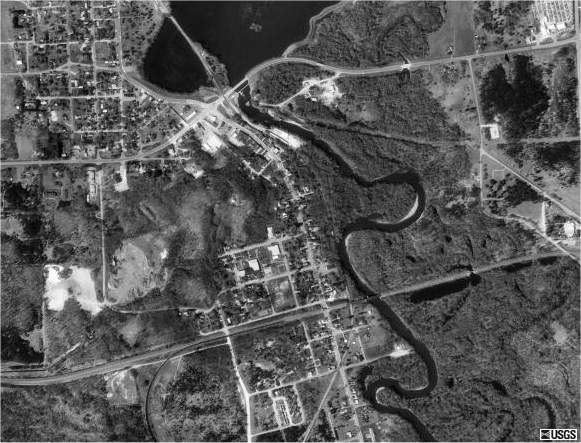
Digital Orthographic Quater-Quads or DOQQ


This DOQQ map can be found at Forestpal.com. DOQQ maps are areial photos that have been orthorectified. This process removes distortion, putting features in their correct position. After a photos has been orthorectified it is useable as a map.

Digtial Elevation Models or DEM


This map of New South Wales is a digital elevation model. Color is used on this map to bring out relief. Without a legend it is still possible to conclude that the red areas are highest and the blue areas are lowest. More information on this map can be found at the New South Wales Government wesbsite.

Digital Line Graph or DLG


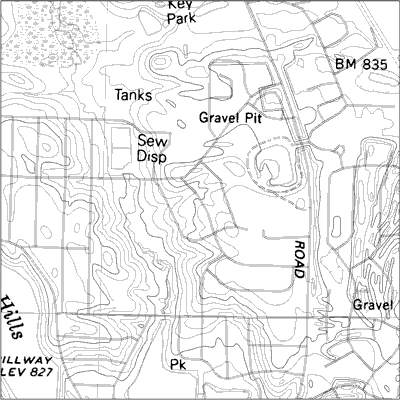
This map found on the USGS website is a digital line graph. Unlike the DRG, these maps use vector rather than raster data. Instead of the data being pixilated the data is stored as lines, points, and areas.

Digital Raster Graphic or DRG


A digital raster graphic is a digital version of a USGS or United States Geological Survey. They are topographic maps that are 7.5 min of latitude and 7.5 min of longitude with a scale of 1:24,000. DRG's are georectified which means it has been linked to real world positions using coordinates, datum, and projection. This map came from the Illinois Natural Resources Geospatial Data Clearinghouse.

Bivariate Choropleth Map

The bivariate choropleth map shown here is using both color and proportional circle to show a relationship between the ratio of male to femal workers and the average income of male and female workers. This was found on an Intro to GIS site. Bivariate choropleth maps are thematic maps showing relationships between two variables.

Wednesday, June 11, 2008

Unclassed Choropleth Map

This map shows the divorce rates in the united states by area. That's what makes it a choropleth map. It is an unclassed choropleth map because it uses a continuous scale. There are as many intervals as there are areal units. I found this map on the ESRI website in a paper written by Naresh Kumar